Freedays‘09 Recap
Freedays was great as usual. Seminars and workshops were interesting and informative. In my opinion organization was flawless as well. I think this is a result of LKD and Bilgi University teams’ coordinating together1.
How Not To Advocate Linux
Nice presentation by Enver Altın. Short slides2, confident, humorous and to-the-point style. Careful preparation is usually evident in good presentations. Overall I liked it very much. What he says basically is:
- Don’t throw mud at M$
- Be concise and empathize the audience
- Linux is not perfect, but it has strong points
- Emphasize freedom and independency
- Free software communities must be united
Some LKD people tried to undermine the seminar becase it contained criticism of LKD. I don’t know what were they actualy trying to accomplish, but they didn’t distrupt the event for long enough. All they accomplished is to show what kind of people you’ll be dealing with if you join LKD. Well done!
The Efficiency of Open Source Software Development
Is open source way of development efficient? I don’t know. This very interesting seminar topic, and appereantly very interesting research, was murdered with lots and lots of details on research methodology and details on the particular data sample used. If more time was spent on the findings and observations, this talk could be much more interesting and informative for the audience. I think the conclusion was that the OSS way is more efficient.. no, no, it wasn’t.. or was it? :D
Django & Ruby Workshops
Can Burak Çilingir gave a nice workshop on Django. He first explained all the key concepts and then we did some coding. Even though we couldn’t create a working app, It was gentle introduction to Django. There certainly is a need for more Django developers.
I have been wanting to learn RoR for a long time. But I just wasn’t able to wrap my head around Ruby. After Erek Göktürk’s presentation I now, at least, have a rough understanding. Special thanks for his patience with my repetitive questions about blocks. I should learn Rails, and Ruby, better. I believe there are lessons to learn from Rails.
How Embracing Open Source Built Google
This seminar was the only one emphasizing hacker culture over software freedom. Jonathan Conradt of Google Chrome talked about the history of hackers and then the history of Google, Chrome’s implementation and vision and a little bit about Google’s vision. How “silly fast” Chrome is and will be.
The questions phase was a disaster though. Almost all the questions were aimed at Google’s don’t be evil motto, in the form of “you say you are not evil, but you do x and you do y”. One question was “why did Google buy a fighter airplane?”. Another one was “isn’t that creating a monopoly to require a Google ID for Android phones?”. Yeah, to get a Google ID you need to sign with your blood. But the dumbest question was “so you are collecting all these personal information. Do you share them with NSA?”. Do you guys really think all that SPAM you are getting is the result of harvesing e-mails from public websites? Wisen up a little bit please.
I wouldn’t be surprised, with this kind of treatment, if Google never ever EVER sends a representative again. Should we have kissed Google’s ass. No, that’s equally low. But trying to play I’m going to take you down with my questions is at the very least hostile. I have even heard one guy saying “oh, he didn’t take my question because he must have sensed that I’ll ask a difficult one”. We all witnessed someone else complaining the government to a representative of a foreign company for developing IE only websites.
Copyleft
This one, by Koray Löker, was by far the best seminar for me. The name of the presentation is actually something like; An Elegant Pass from Free Software to Culture Industry: Copyleft. He was well prepared, the topic was interesing and the rhythm of the presentation was almost perfect. If I was able to pick one session to recommend, this would be it.
Sometimes you need to step away, and even step out of your problem to gain a better understanding of it. Investigating open source movies4 may give us insights about sharing, freedom and, most importantly, originality aspects of open source software. Brilliant idea.
See You Next Year
Freedays is the only major event for free software community in Türkiye. I would like to thank everybody for their selfless efforts and the sponsors for making it possible.
Hope to see you there next year.
1: This year two events, Freedays of Bilgi University and Linux and Free Softare Festival of LDK, are merged.
2: Few in number, short in content. Mostly a few words per slide. I hate presentations with 1000 slides and 100 words per slide.
3: Compared to conventional development methods used for propriety software.
4: Such as Elephants Dream and Big Buck Bunny.
Django: Where Should My App Live
Python is my preferred language and Django is my preferred environment for web applications. Django’s probably the most important strength is how it splits different parts of an application and allows (and encourages) decoupling between them. This way you get to have many small re-usable and, if designed well, highly configurable apps (in Django terms).
The frameworks itself comes with a set of apps, contrib apps. These are officially supported applications for most general tasks. For example Django has a syndication app that allows you to create feeds for your content easily, a comments app for.. well comments, a redirects app for dynamically managing URL redirects. And let’s not forget the renowned admin app.
Third party re-usable apps can be used to complement contrib apps. These apps provide more specific funtionality, such as providing a dynamically generated robots.txt. Third party apps usually have no dependencies other than Django (and therefore contrib apps). Best third party apps are the ones that provide just enough functionality on one task. It’s the similarity with UNIX philosophy that makes Django apps so attractive; do one thing, do it well.
Finally there is your project specific code. Although it is not a must, I think it is a good design pattern to put project specific code in one or more project specific apps. These apps will probably have lots of dependencies to other apps, but that is cool. These apps will only function as glue between re-usable apps.
Django Default
How does django-admin (or manage.py within your project) handle apps? “manage.py startapp appname” command creates a new app inside your project directory with the following file structure:
appname/
    __init__.py
    models.py
    views.py
And then, assuming your project directory name is myproject, you can import your models like “from myproject.appname.models import Foo”. Two things to note here:
- Your new app is inside your project directory. This is normal, but significant at the same time. More on this later.
- Your code is coupled with the project directory’s name. You might be fine with it in the beginning, but at some point you should realize that the project you are working on is not a library, it is an application. Therefore it ought to be independent of the containing folder name. But the real problem is that your app is coupled with the project, tightly.
The first point is not an obstacle until you decide to distribute your app individually. An app is just a library, it can live anywhere inside your PYTHONPATH. In other words; as long as you can import it, location of your app is irrelevant.
The second point is important. If you plan to re-use your apps, you need to:
- Make sure you have cleaned up all project specific code.
- Minimize dependencies to other apps, especially non-contrib apps.
Adding Project Directory To PYTHONPATH
A quick fix could be to add the project directory to PYTHONPATH. This makes all libraries within accessible from python.
You don’t need to modify PYTHONPATH for development server. But for both development and production environments you will need to modify your settings.py with the following:
import os

# Absolute path for the project directory
_PATH = os.path.abspath(os.path.dirname(__file__))

# Name of the project directory
_MODULE = os.path.basename(_PATH)


# Define absolute path for media
MEDIA_ROOT = _PATH + '/media/'

# Decouple project directory
ROOT_URLCONF = _MODULE + '.urls'

# Import apps within porject directory
# independent from its name
INSTALLED_APPS = (
    'django.contrib.auth',
    'django.contrib.contenttypes',
    'django.contrib.sessions',
    'django.contrib.sites',
    _MODULE + '.myapp',
    _MODULE + '.yourapp',
)
This only makes project directory an independent variable, adding a bit of flexibility. But your apps are still within the project directory and from a practical point of view; they are not yet ready to be shared between projects.
Seperating Apps From Projects
As I said above, and app is a library. If you can import it, it can live anywhere. I personally prefer putting all my re-usable apps in one directory and symlinking them somewhere within PYTHONPATH
# Import apps directly
INSTALLED_APPS = (
    'django.contrib.auth',
    'django.contrib.contenttypes',
    'django.contrib.sessions',
    'django.contrib.sites',
    'myapp',
    'yourapp',
)
Now if your app is decoupled in code level it should be re-usable since we have decoupled it from the project directory. This, however easy at the beginning, introduces a little more work in terms of maintenance. You need to deploy and maintain your re-usable apps and projects seperately.
Lifetime Of An App
I always do my best to model any app as re-usable. But to speed up my first few iterations I follow the plan below:
- First thing I do when I create a new project is to set up _MODULE & _PATH in my settings.py.
- Initially I allow my apps to be tightly coupled. Adding customizability and extensibility where it is easy.
- Once it functions the way I want, I start de-coupling. If it is truly project-specific code, I just spend minimal effort de-coupling. I don’t think this is a waste of time. It will probably pay off in the future as less maintenance cost.
- When the app has minimal dependencies, I move it to my django apps dir. So far I have had the advantage of using the same (source control) repository with the project. But now the app is mature and it should live in its own repository.
Using Layouts In Qooxdoo - Part 4: Grid Layout
This is the fourth part of a tutorial series about layout managers, container objects and object hierarchies in Qooxdoo. Read the first part here.
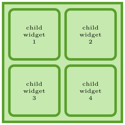
qx.ui.layout.Grid is like a combined VBox & Hbox. Grid supports:
- Variable width/height columns/rows.
- Cells spanning multiple columns/rows.
- Empty cells.
Here is a simple application using a Grid layout:
/*
#asset(grid/*)
*/
qx.Class.define("grid.Application",
{
    extend: qx.application.Standalone,
    members: {
        main: function(){
            this.base(arguments);

            var main_container = new qx.ui.container.Composite();

            var layout_manager = new qx.ui.layout.Grid();
            main_container.setLayout(layout_manager);

            main_container.add(new qx.ui.form.Button("Child Widget 1"), {row: 0, column: 0});
            main_container.add(new qx.ui.form.Button("Child Widget 2"), {row: 0, column: 1});
            main_container.add(new qx.ui.form.Button("Child Widget 3"), {row: 0, column: 2});
            main_container.add(new qx.ui.form.Button("Child Widget 4"), {row: 1, column: 0});
            main_container.add(new qx.ui.form.Button("Child Widget 5"), {row: 1, column: 1});
            main_container.add(new qx.ui.form.Button("Child Widget 6"), {row: 1, column: 2});

            var application_root = this.getRoot();
            application_root.add(main_container);
        }
    }
});
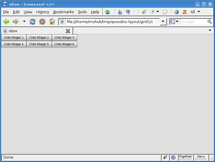
We have created an 3x2 table layout without explicitly stating row/column count. Just set your row and column layout preferences when you add your child widgets.
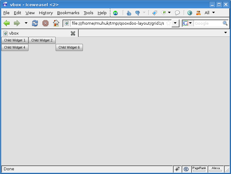
Try commenting out some cells to see what happens. If you, for example, comment out second (0,1) and fifth (1,1) cells the second column disappears. But missing cells are OK otherwise. You can see below the layout when third and fifth cells are commented:
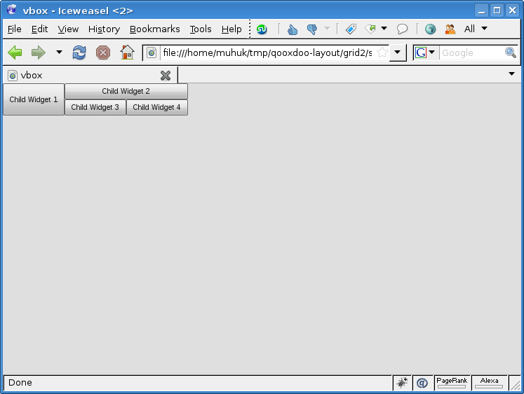
Following example illustrates row/column spanning:
/*
#asset(grid/ *)
*/
qx.Class.define("grid.Application",
{
    extend: qx.application.Standalone,
    members: {
        main: function(){
            this.base(arguments);

            var main_container = new qx.ui.container.Composite();

            var layout_manager = new qx.ui.layout.Grid();
            main_container.setLayout(layout_manager);

            main_container.add(new qx.ui.form.Button("Child Widget 1"), {
                row: 0,
                column: 0,
                rowSpan: 2
            });
            main_container.add(new qx.ui.form.Button("Child Widget 2"), {
                row: 0,
                column: 1,
                colSpan: 2
            });
            main_container.add(new qx.ui.form.Button("Child Widget 3"), {
                row: 1,
                column: 1
            });
            main_container.add(new qx.ui.form.Button("Child Widget 4"), {
                row: 1,
                column: 2
            });

            var application_root = this.getRoot();
            application_root.add(main_container);
        }
    }
});
Spanning is easy, just like HTML tables. But we set placement (row and column parameters) explicitly. We can add our widgets in any order and still get the same layout if we use the same preferences.
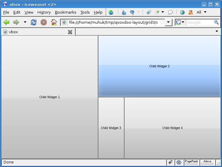
As I said in the beginning of this part Grid is like a combination of VBox and HBox. Therefore flexing is two dimensional:
/*
#asset(grid/ *)
*/
qx.Class.define("grid.Application",
{
    extend: qx.application.Standalone,
    members: {
        main: function(){
            this.base(arguments);

            var main_container = new qx.ui.container.Composite();

            var layout_manager = new qx.ui.layout.Grid();
            layout_manager.setRowFlex(0, 1);
            layout_manager.setRowFlex(1, 1);
            layout_manager.setColumnFlex(0, 1);
            layout_manager.setColumnFlex(2, 1);
            main_container.setLayout(layout_manager);

            main_container.add(new qx.ui.form.Button("Child Widget 1"), {
                row: 0,
                column: 0,
                rowSpan: 2
            });
            main_container.add(new qx.ui.form.Button("Child Widget 2"), {
                row: 0,
                column: 1,
                colSpan: 2
            });
            main_container.add(new qx.ui.form.Button("Child Widget 3"), {
                row: 1,
                column: 1
            });
            main_container.add(new qx.ui.form.Button("Child Widget 4"), {
                row: 1,
                column: 2
            });

            var application_root = this.getRoot();
            application_root.add(main_container);

            application_root.addListener("resize", function(e) {
                main_container.set({
                    "width": qx.bom.Viewport.getWidth(),
                    "height": qx.bom.Viewport.getHeight(),
                });
            }, this);
        }
    }
});
We have set rowFlex (vertical) and columnFlex (horizontal) for specific rows/columns on the layout manager itself. Try resizing the window to see how cells react. Note that second column (column index 1) doesn’t flex horizontally.
NEXT PART Using Layouts In Qooxdoo - Part 5: Basic & Canvas
Using Layouts In Qooxdoo - Part 3: HBox Layout
This is the third part of a tutorial series about layout managers, container objects and object hierarchies in Qooxdoo. Read the first part here.
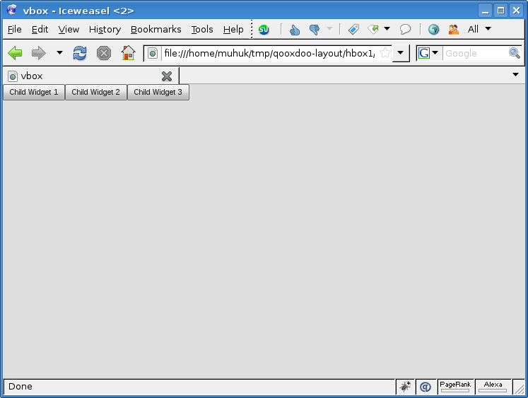
qx.ui.layout.HBox layout manager is similar to VBox but it places its children side by side.
Let us begin with a simple application:
/*
#asset(hbox/*)
*/
qx.Class.define("hbox.Application",
{
    extend: qx.application.Standalone,
    members: {
        main: function(){
            this.base(arguments);

            var main_container = new qx.ui.container.Composite();

            var layout_manager = new qx.ui.layout.HBox();
            main_container.setLayout(layout_manager);

            main_container.add(new qx.ui.form.Button("Child Widget 1"));
            main_container.add(new qx.ui.form.Button("Child Widget 2"));
            main_container.add(new qx.ui.form.Button("Child Widget 3"));

            var application_root = this.getRoot();
            application_root.add(main_container);
        }
    }
});
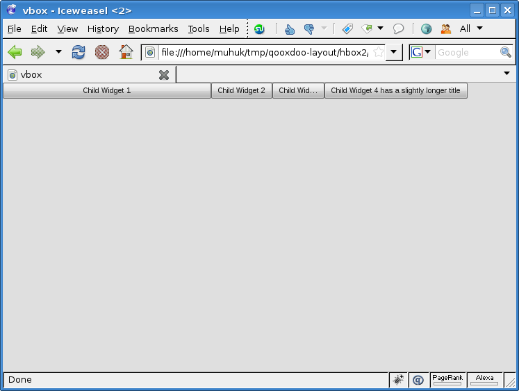
Ok, nothing special here. In the next example we will see how we can apply different constraints to individual child elements:
/*
#asset(hbox/*)
*/
qx.Class.define("hbox.Application",
{
    extend: qx.application.Standalone,
    members: {
        main: function(){
            this.base(arguments);

            var main_container = new qx.ui.container.Composite();

            var layout_manager = new qx.ui.layout.HBox();
            main_container.setLayout(layout_manager);

            main_container.add(new qx.ui.form.Button(
                                           "Child Widget 1").set({width:300}));
            main_container.add(new qx.ui.form.Button("Child Widget 2"));
            main_container.add(new qx.ui.form.Button(
                                            "Child Widget 3").set({width:75}));
            main_container.add(new qx.ui.form.Button(
                                "Child Widget 4 has a slightly longer title"));

            var application_root = this.getRoot();
            application_root.add(main_container);
        }
    }
});
We have set some properties on child widgets here. I know, it’s a bit ugly doing it on the same line with the addition. But screen space is more expensive now on the intertubes since the economic crisis1. The important point here is we have set width of first and third widgets explicitly. Second and fourth will be automatically sized. Also notice that the fourth widget is wider. Buttons consider length of their labels when calculating their sizes.
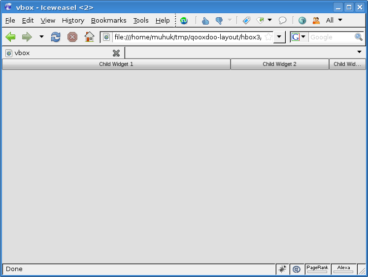
The container will also be auto-sized on creation. But it won’t fill the viewport since we haven’t coded this behaviour (see previous part). Next example will include this behaviour:
/*
#asset(hbox/*)
*/
qx.Class.define("hbox.Application",
{
    extend: qx.application.Standalone,
    members: {
        main: function(){
            this.base(arguments);

            var main_container = new qx.ui.container.Composite();

            var layout_manager = new qx.ui.layout.HBox();
            main_container.setLayout(layout_manager);

            main_container.add(new qx.ui.form.Button("Child Widget 1").set({
                width: 300,
                allowGrowX: true,
            }), {flex: 1});
            main_container.add(new qx.ui.form.Button("Child Widget 2").set({
                minWidth: 75,
                maxWidth: 200,
            }), {flex: 1});
            main_container.add(new qx.ui.form.Button("Child Widget 3").set({
                width: 75,
                allowGrowX: false,
            }), {flex: 1});

            var application_root = this.getRoot();
            application_root.add(main_container);

            application_root.addListener("resize", function(e) {
                main_container.set({
                    "width": qx.bom.Viewport.getWidth(),
                });
            }, this);
        }
    }
});
We have quite a few changes this time. First of all each widget is set to flex. First and third widgets have their (different) widths explicitly set. Growing is enabled for the first two and disabled for the third. For the second widget we have created different constraints; we have set the maximum and minimum values for width.
Try resizing the window to see how each widget reacts. We should note that the second widget never goes beyond its limits. While the other two conform to fit the containers space. MinWidth and MaxWidth are stronger constraints than width.
Let’s try constraining the container’s size:
/*
#asset(hbox/ *)
*/
qx.Class.define("hbox.Application",
{
    extend: qx.application.Standalone,
    members: {
        main: function(){
            this.base(arguments);

            var main_container = new qx.ui.container.Composite();

            var layout_manager = new qx.ui.layout.HBox();
            main_container.setLayout(layout_manager);
            main_container.set({
                maxWidth: 900,
                minWidth: 400,
            });

            main_container.add(new qx.ui.form.Button("Child Widget 1").set({
                width: 300,
                allowGrowX: true,
            }), {flex: 1});
            main_container.add(new qx.ui.form.Button("Child Widget 2").set({
                minWidth: 75,
                maxWidth: 200,
            }), {flex: 1});
            main_container.add(new qx.ui.form.Button("Child Widget 3").set({
                width: 75,
                allowGrowX: false,
            }), {flex: 1});

            var application_root = this.getRoot();
            application_root.add(main_container);

            application_root.addListener("resize", function(e) {
                main_container.set({
                    "width": qx.bom.Viewport.getWidth(),
                });
            }, this);
        }
    }
});
We have set the maximum and minimum width for the container widget. If you resize the window you should notice the container obeying these constraints.
VBox & HBox Wrap-up
VBox and HBox are simple layout managers. I have mostly tried to illustrate how container preferences, layout preferences and child widget preferences work together with examples. In the next chapters we’ll work on more advanced layout managers and then composite layouts with multiple containers.
NEXT PART: Grid Layout
1: This is a lame joke, I’ve just done that for the sake of brevity.
2: This is redundant. Grow and Shrink properties are true by default.
Using Layouts In Qooxdoo - Part 2: VBox Layout
This is the second part of a tutorial series about layout managers, container objects and object hierarchies in Qooxdoo. Read the first part here.
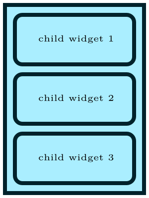
qx.ui.layout.VBox is a basic layout manager that places child widgets on top of each other.
Let’s see how VBox lays out components on a simple application1. All the necessary code is below:
/*
#asset(vbox/*)
*/
qx.Class.define("vbox.Application",
{
    extend: qx.application.Standalone,
    members: {
        main: function(){
            this.base(arguments);
            var main_container = new qx.ui.container.Composite();
            var layout_manager = new qx.ui.layout.VBox();
            main_container.setLayout(layout_manager);

            main_container.add(new qx.ui.form.Button("Child Widget 1"));
            main_container.add(new qx.ui.form.Button("Child Widget 2"));
            main_container.add(new qx.ui.form.Button("Child Widget 3"));

            var application_root = this.getRoot();
            application_root.add(main_container);
        }
    }
});
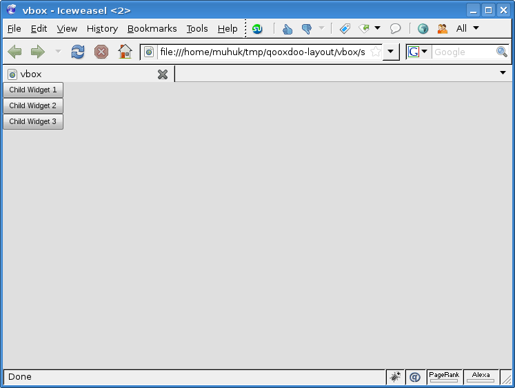
I told you VBox is basic; child widgets are stacked vertically in order they have added. We haven’t set any preferences (constraints), so it’s all defaults. Button``s get an optimal width depending on the length of their label. The container ``main_container applies this width to itself, it conforms its children’s dimensions.
Try giving one of the buttons a longer label. Now the modified button is wider, that was expected. But the others are widened as well. That is because they have conformed (flexed) their container’s width. We will see how this works in detail.
Let’s set the container’s size same as the viewport’s:
/*
#asset(vbox/*)
*/
qx.Class.define("vbox.Application",
{
    extend: qx.application.Standalone,
    members: {
        main: function(){
            this.base(arguments);

            var main_container = new qx.ui.container.Composite();
            main_container.setWidth(qx.bom.Viewport.getWidth());
            main_container.setHeight(qx.bom.Viewport.getHeight());

            var layout_manager = new qx.ui.layout.VBox();
            main_container.setLayout(layout_manager);

            main_container.add(new qx.ui.form.Button("Child Widget 1"));
            main_container.add(new qx.ui.form.Button("Child Widget 2"));
            main_container.add(new qx.ui.form.Button("Child Widget 3"));

            var application_root = this.getRoot();
            application_root.add(main_container);
        }
    }
});
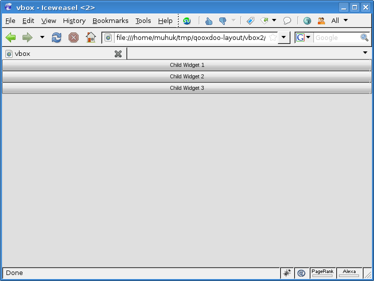
Notice that only width seems to be adjusted, even though we have set both dimensions. Actually, it worked as we intended to; main_container now fills the entire viewport. But by default VBox won’t flex child widgets vertically. We will start overriding this behaviour in a minute.
Try setting alignY property to "center" or "bottom" on the layout manager:
layout_manager.setAlignY("bottom");
So far we have set properties (constraints) on containers (main_container.width & main_container.height) and on layout managers (layout_manager.alignY). In the next example we will set properties on child widgets:
/*
#asset(vbox/*)
*/
qx.Class.define("vbox.Application",
{
    extend: qx.application.Standalone,
    members: {
        main: function(){
            this.base(arguments);

            var main_container = new qx.ui.container.Composite();
            main_container.setWidth(qx.bom.Viewport.getWidth());
            main_container.setHeight(qx.bom.Viewport.getHeight());

            var layout_manager = new qx.ui.layout.VBox();
            main_container.setLayout(layout_manager);

            main_container.add(new qx.ui.form.Button("Child Widget 1"), {flex: 1});
            main_container.add(new qx.ui.form.Button("Child Widget 2"), {flex: 1});
            main_container.add(new qx.ui.form.Button("Child Widget 3"), {flex: 1});

            var application_root = this.getRoot();
            application_root.add(main_container);
        }
    }
});
We have added a second parameter to the add method of layout manager. This JavaScript object literal is used to set widget specific properties on the layout manager.
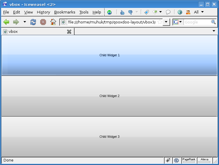
Flex property determines how the extra space2 is distributed between children. By default it is set to 0, which means that the widget will not grow vertically. Any other (integer) value for flex will cause growing to occupy the extra space. Growing is proportional to flex value. Try different flex values for different widgets and see the changes.
NEXT PART: HBox Layout
1: If you haven’t created a qx application before, it is explained in detail in the tutorial.
2: Remaining space after initial dimensions of children are computed.
